I was going through some of my files and I came across this write-up that I had written as a part of the course, History of Graphics Design in Coursera. It seems [surprisingly] well written and was also lauded by my evaluators. I thought it was worth sharing! To set a context, I had to write about how the trends of advertising strategies have changed over time and I had to pick a case-study to analyse as well.

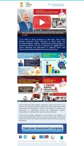
So, I chose this e-mail from the current Government of India. It was quite interesting to see that the current government has chosen to continue using technology, and not just limit themselves to during the elections. This is how a typical mail from the government looks like. You do not need to actually see what’s written to drive my point home. Just notice the amount of writing, and the placement of the graphic elements in the mail.
The following is me quoting myself:
The product that I’ve chosen is an e-mail advertisement from the Government of India. The National Informatics Center (NIC) has created the email. The email serves as an information brochure to the citizens of the nation. It’s very convenient to track the government’s progress and get the updates on the new schemes that the government proposes. This is never seen before in India and is very unlike the previous governments that were in power. From a different perspective, it serves as an advertisement to the current government. By the time, the next elections take place, they would have already spread their word and would have a stronger foothold on the population.
We see a lot of national programs starting off in the country, and email is a very cheap mass communication means. This is obviously one strategy, the strategy of mass communicating. But what I want to talk about is an outdated strategy that they have adopted in their emails. If you have a look at the recent mail (attached), it feels very unprofessional. It is also inconvenient to go through the mail with so much written around. The programs are defined and it’s functionality is over-elaborated, all cramped in one place. True that this email is to spread awareness about the national programs. We know awareness programs are taken up when the information spread has not happened efficiently. But how much awareness can you spread if the awareness program itself is inefficient?! An analogy can be drawn directly to the last video “Words doing the work”. Advertisers used to follow this strategy, but later the trend that followed, as we can see was that of a minimalistic style.
One probable reason they have used this strategy is because they do not have so much to sell, as to offer us information. Although it is an advertisement of sorts, they can afford to not adopt conventional strategies because they already have our attention. We want to know what the government has to offer because we are paying our taxes and we need to read the benefits now. This is certainly different from the case where, say someone is trying to sell me a phone. They do not have my money yet, so they need to lure me in. They make it as easy as possible for me to buy their phone.
Another possibility is that because the Govt. of India is trying to provide us information and not sell something off to us, and also because the strategies are unimportant to heed to they don’t have to invest much on advertisements. Such poor budgets in advertisements would only allow them to hire poor ad-designers.
On the closing note, since they do not have much incentive to better it (unlike advertisers), I believe it’ll be a long time before we see a more conveniently readable informational emails/posters.